Mr. Chocolate is a brand that sells everything from chocolate and nuts to cocoa butter, vanilla, and various types of sugars. They also offer praline molds, piping bags, and other kitchen tools, all to help you elevate your inner pastry chef to the next level. Mr. Chocolate caters to both the experienced kitchen connoisseur who knows what they're looking for, as well as the beginner seeking tips and assistance to get started. In addition to selling high-quality products, the brand is dedicated to sharing recipes that are continually developed and made as user-friendly as possible. The company boasts significant knowledge and expertise in the field.

The Breif
Mr. Chocolate is set to start selling the ingredient Sorbitol, and I was tasked with designing the packaging for it. But since the identity was lacking previously, I was given free rein to create material for the entire identity. The packaging design needed to be adapted to be used for more products such as chocolate and nuts later on. Therefore, I had to create a packaging system.
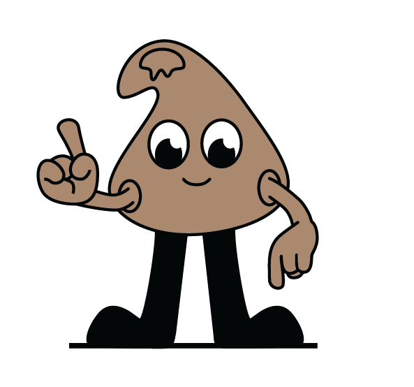
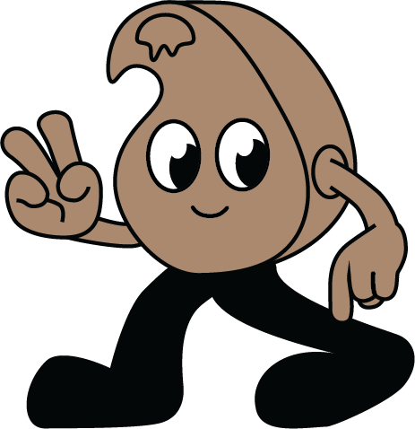
The company also wanted a character/mascot to enhance recognition and reinforce the company's tone. The mascot would be applied to tell fun facts and information about products.
The company also wanted a character/mascot to enhance recognition and reinforce the company's tone. The mascot would be applied to tell fun facts and information about products.
The analysis
I started off making a analysis of both the sorbitol segment and the chocolate segment. The analysis of the different segments gave vastly different results. However, since sorbitol is merely a product sold by the brand, I chose to base the analysis for the brand on the codes of the chocolate segment.
The chocolate market can be categorized in many different spans. However, I decided to split them up at the axis of premium to playful. Since the brand wanted to target both beginners, who is looking for a platform where they can find tips and tricks and recipes as much as the products they need. But also more experienced bakers, who knows what they are looking for and want quick help and good deals I proceeded from that.
Playful
![]()
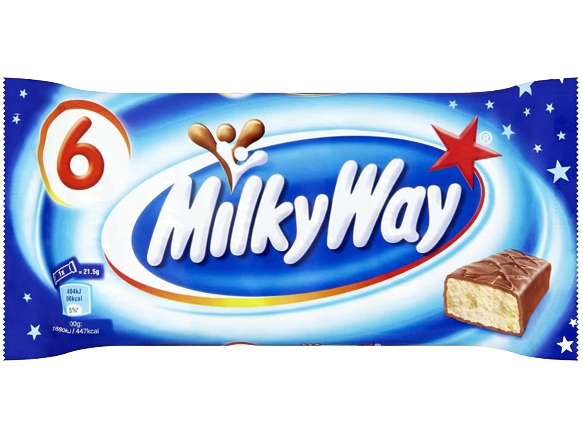
Premium![]()

Playful premium![]()

Similar segments
I also glanced at similar segments, such as coffee. This gave me a greater view and a bigger span of inspiriation to look at when it is time to layout the packaging and design. In the coffee segment I recognized a trend in the “Playful premium” design.
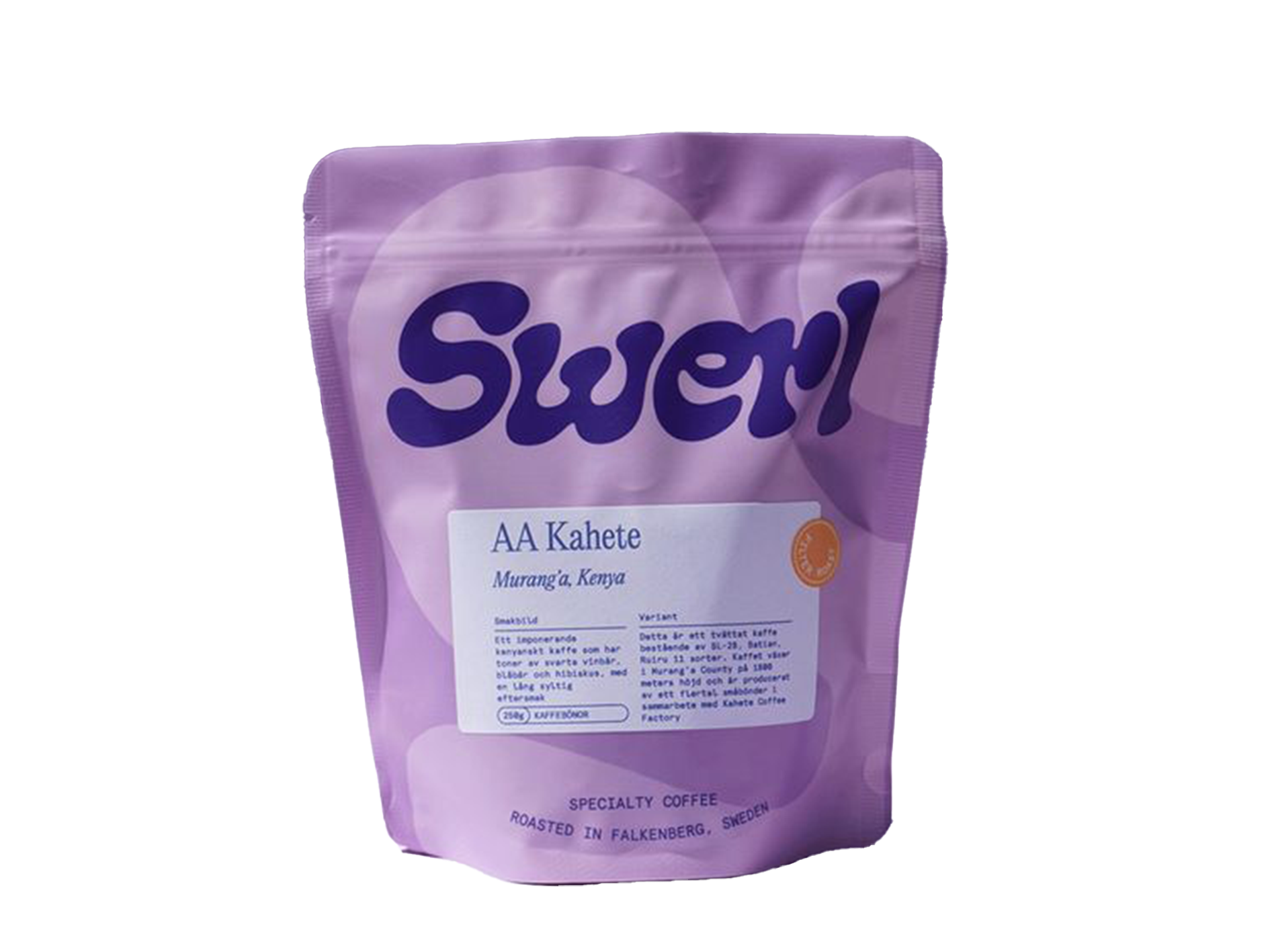
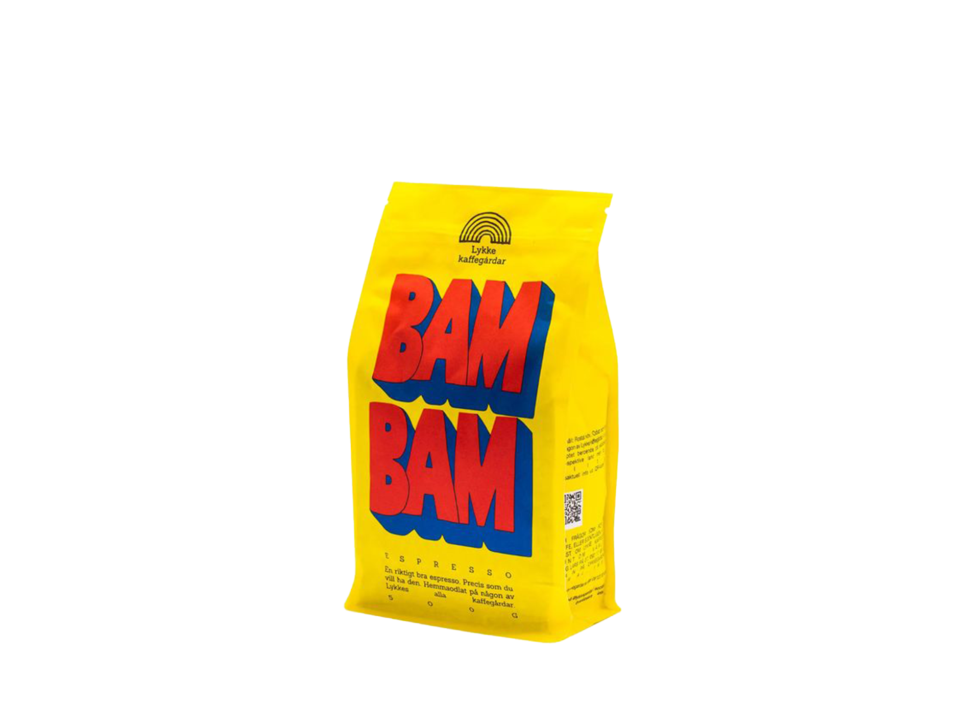
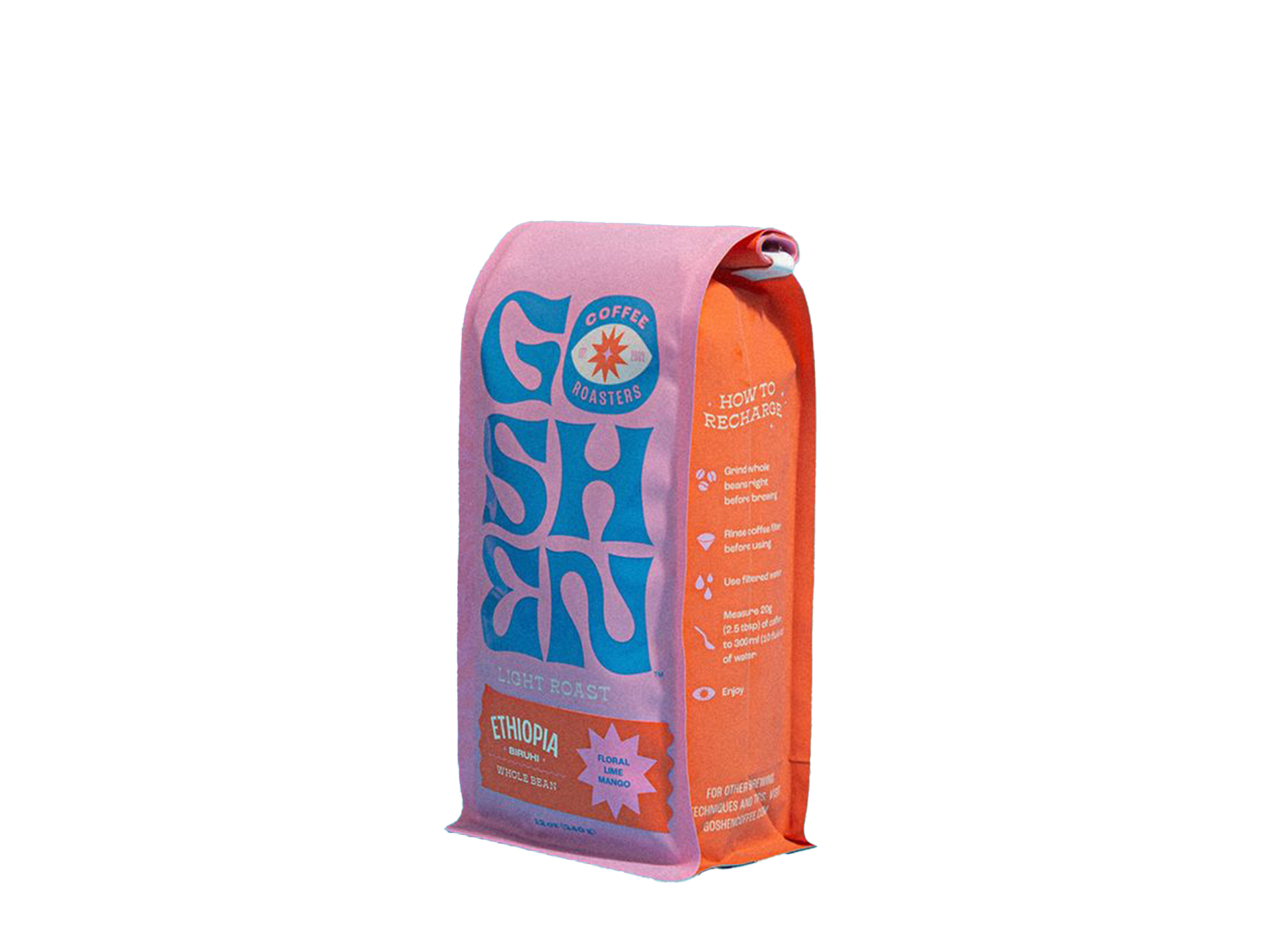
The mascot
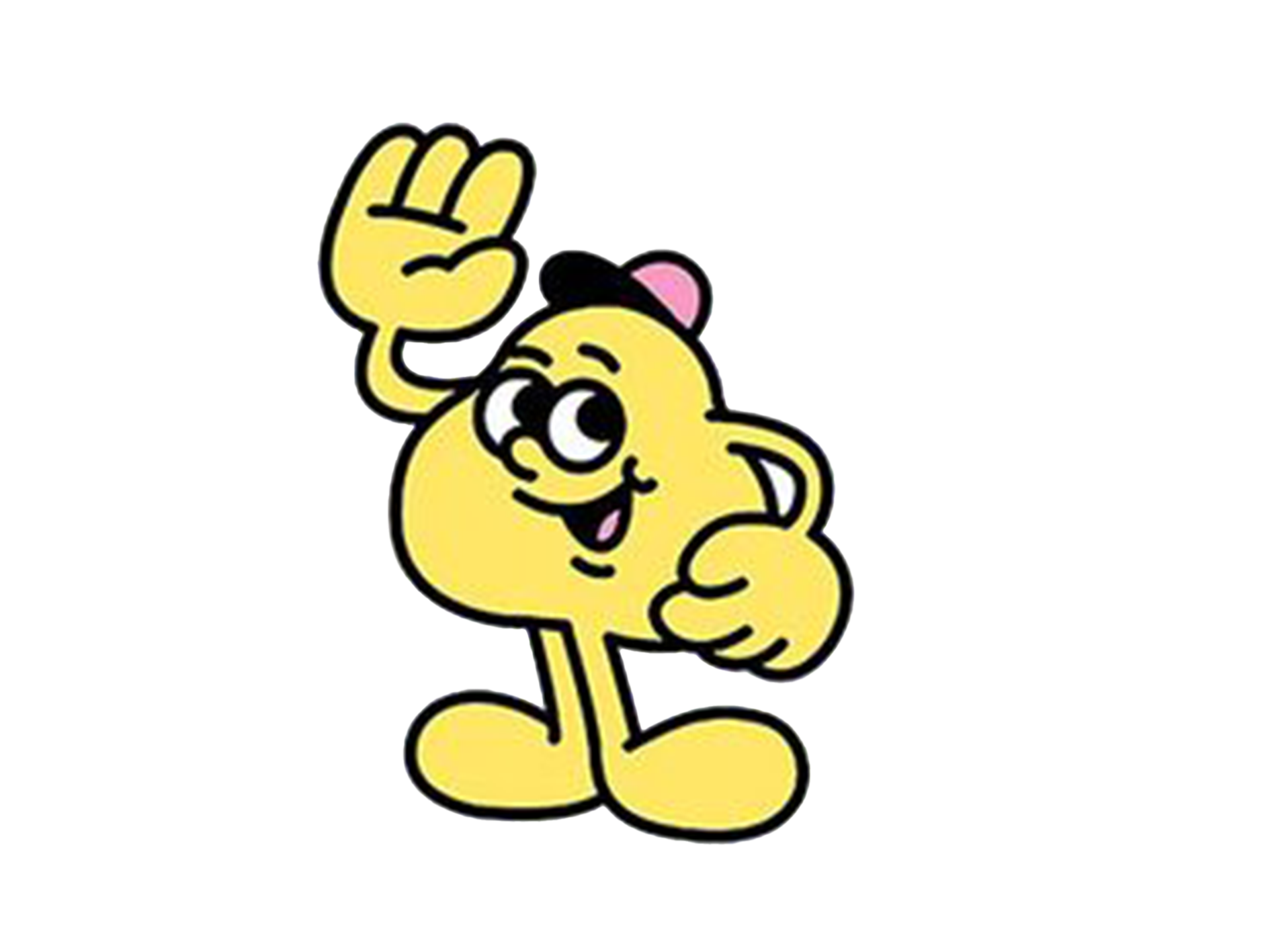
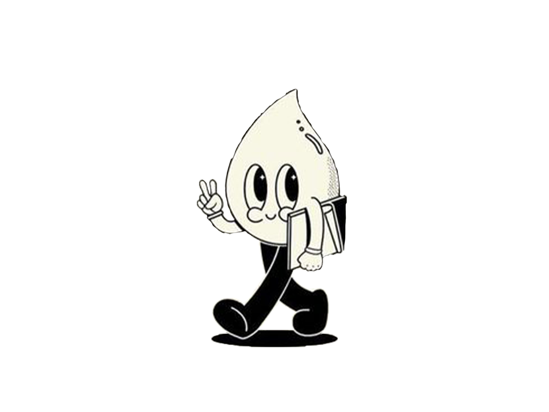
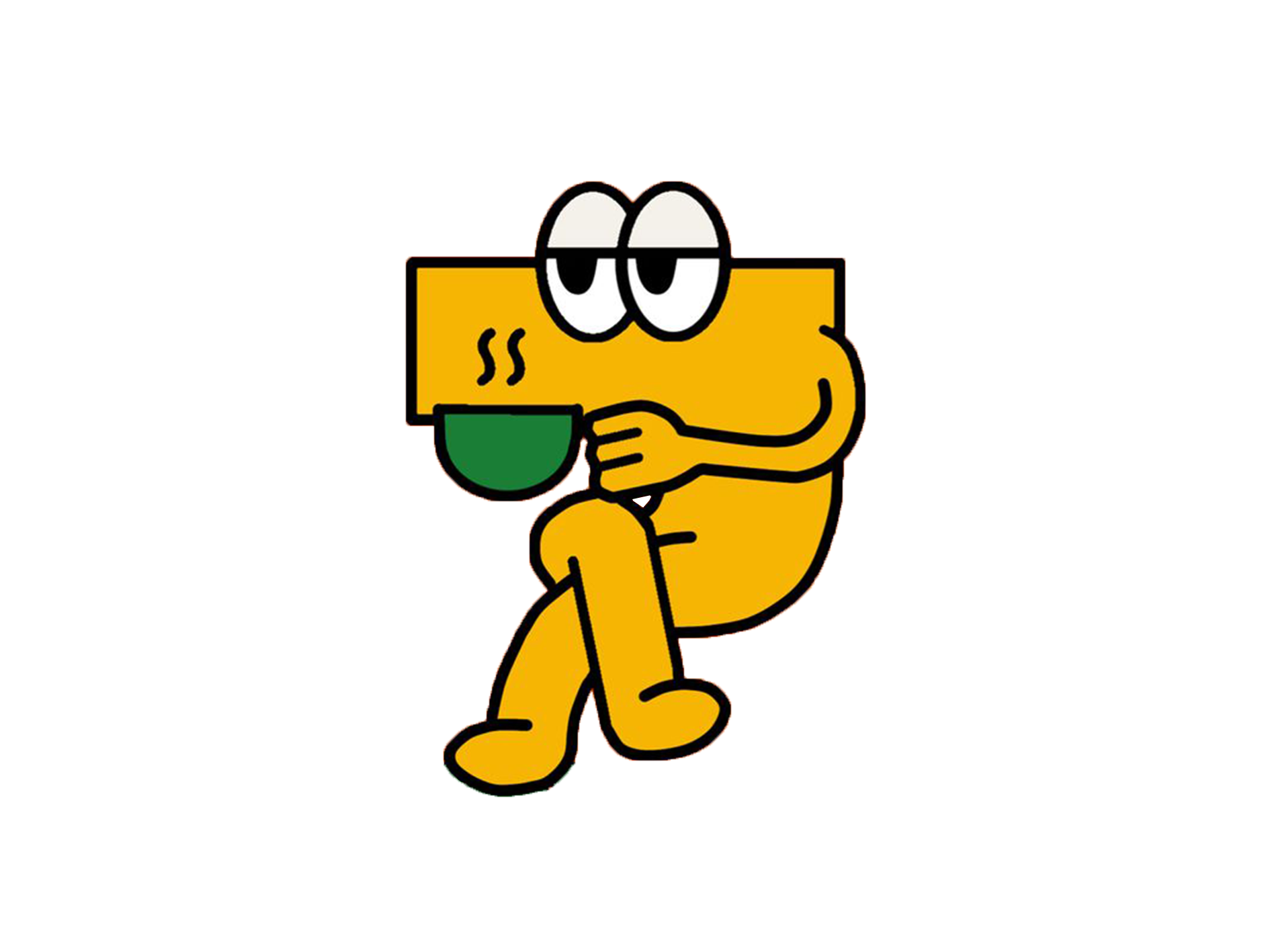
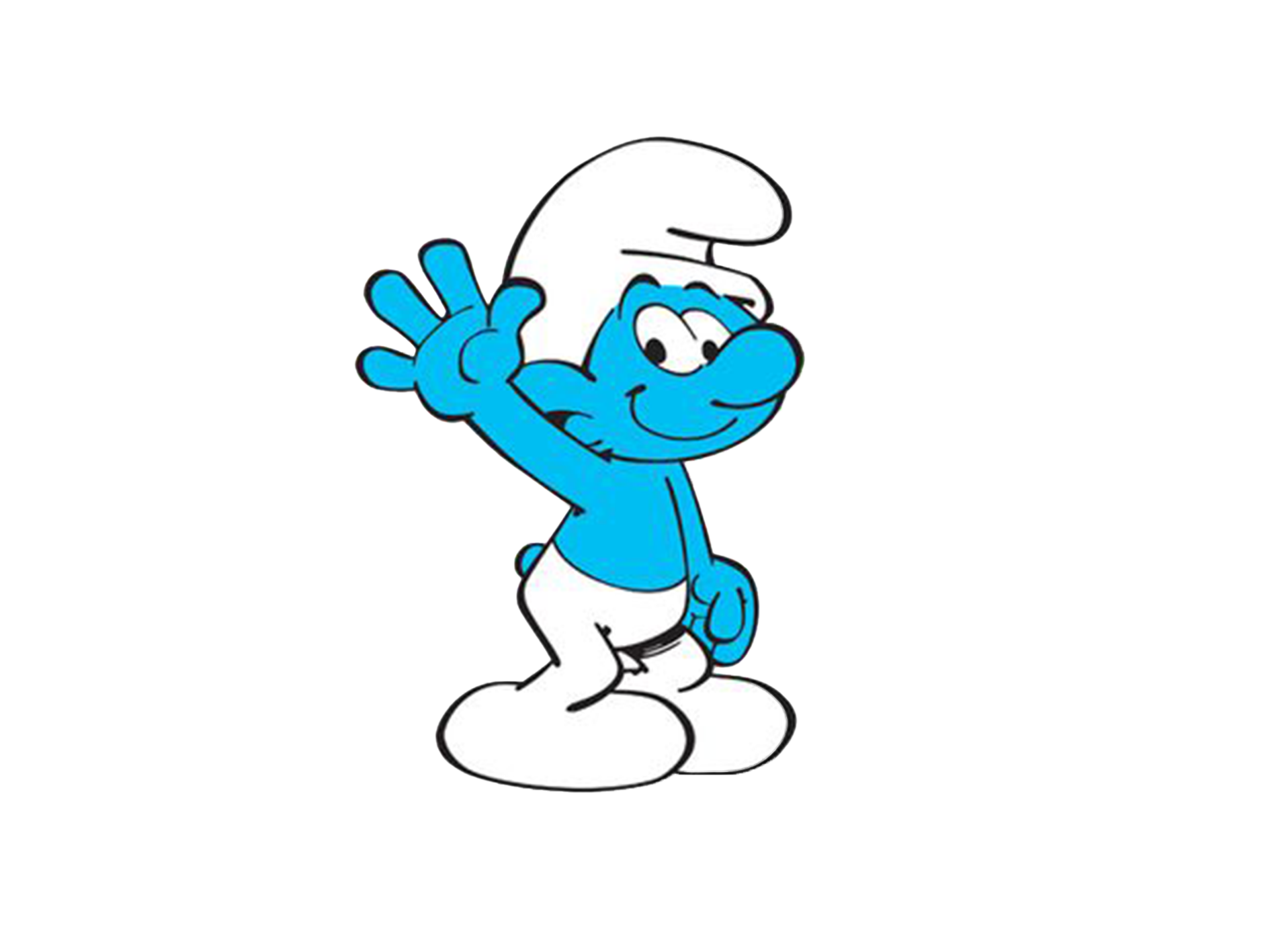
Since I was tasked to illustrate a mascot I also made an analysis of what a character working as a mascot actually looks like, and how it want to say things. I wanted the mascot to easily be recognized with the brand although the brand yet is not so acknowledged. These are some of the inspiration I took to create “Mr. Choco”.
The result
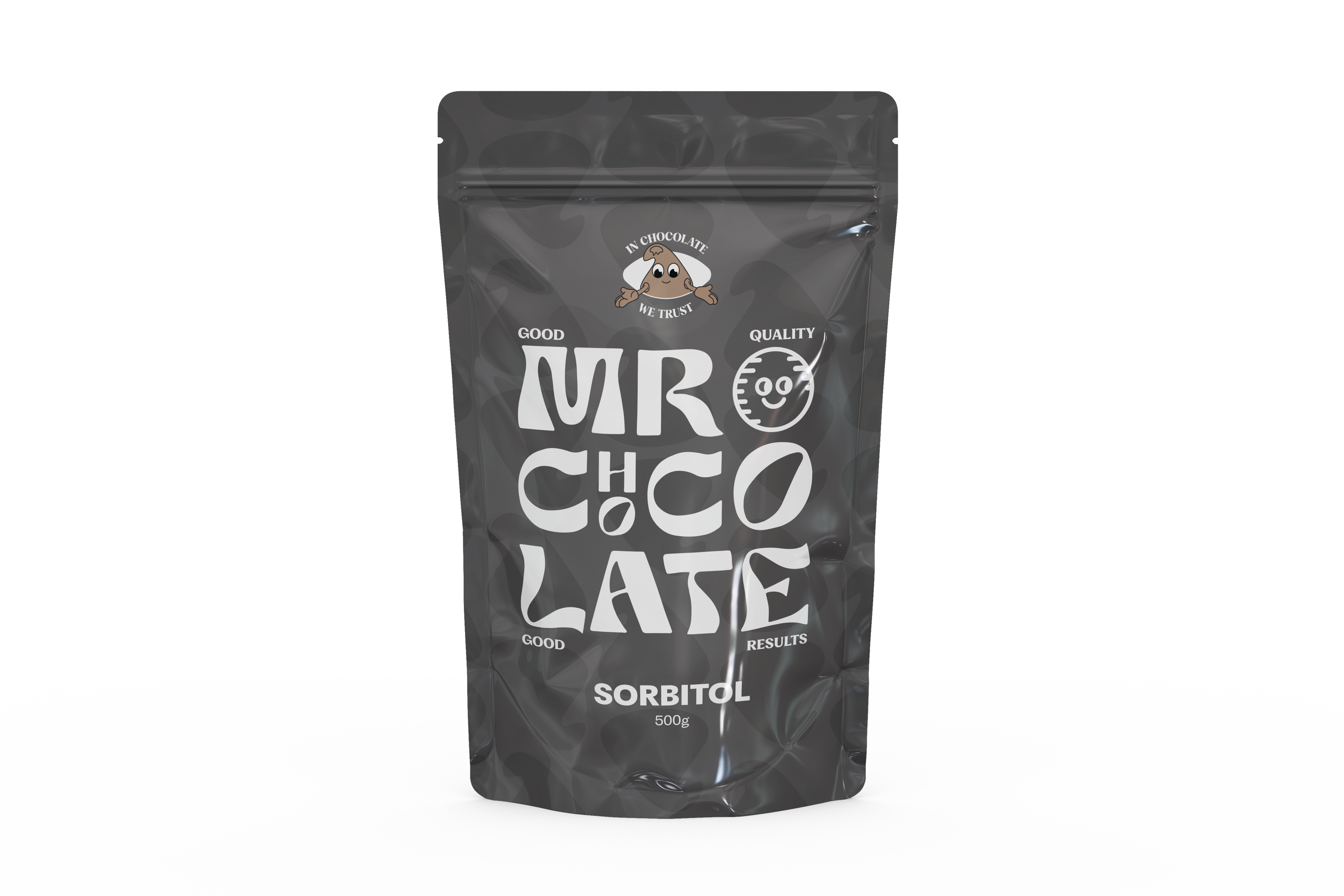
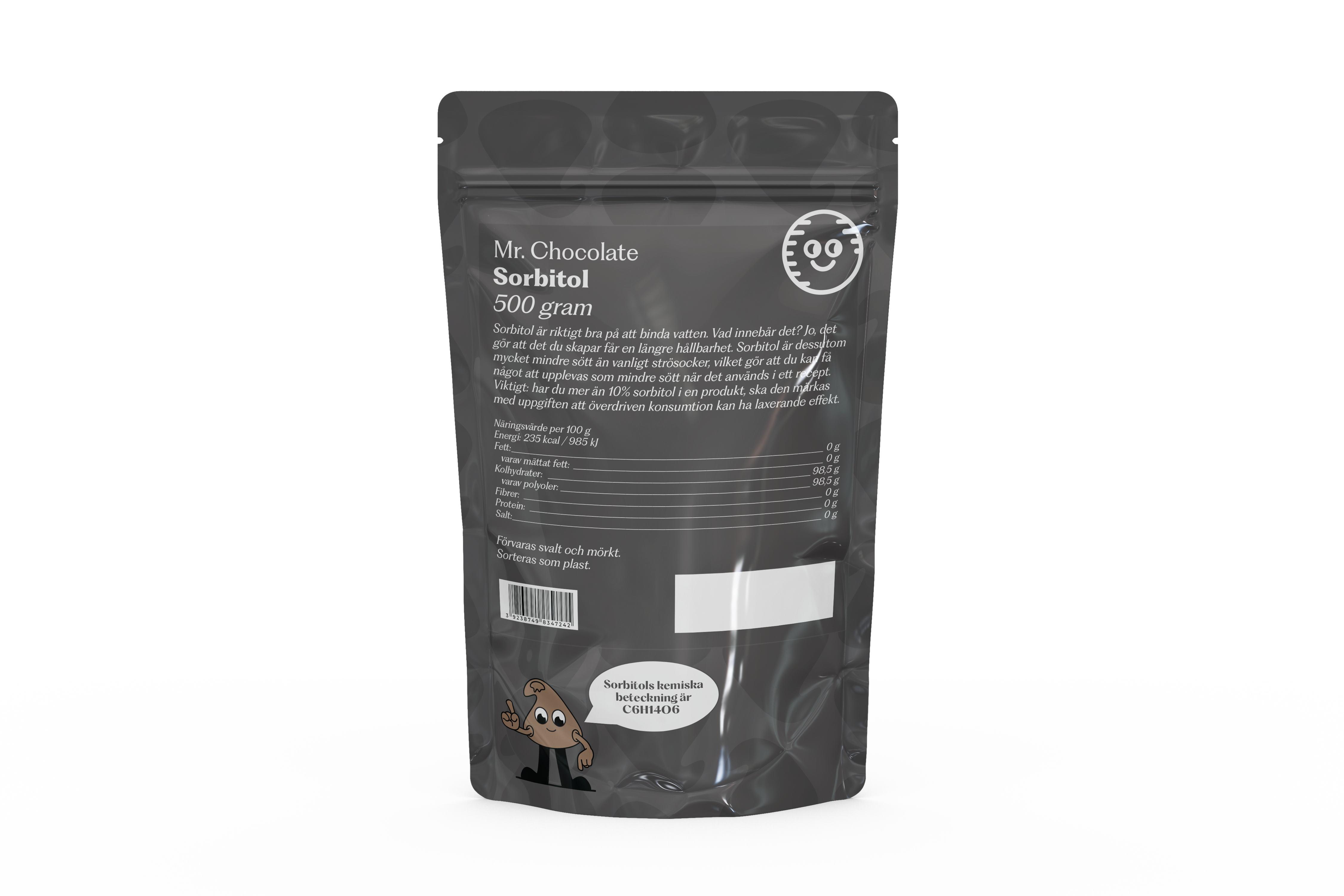
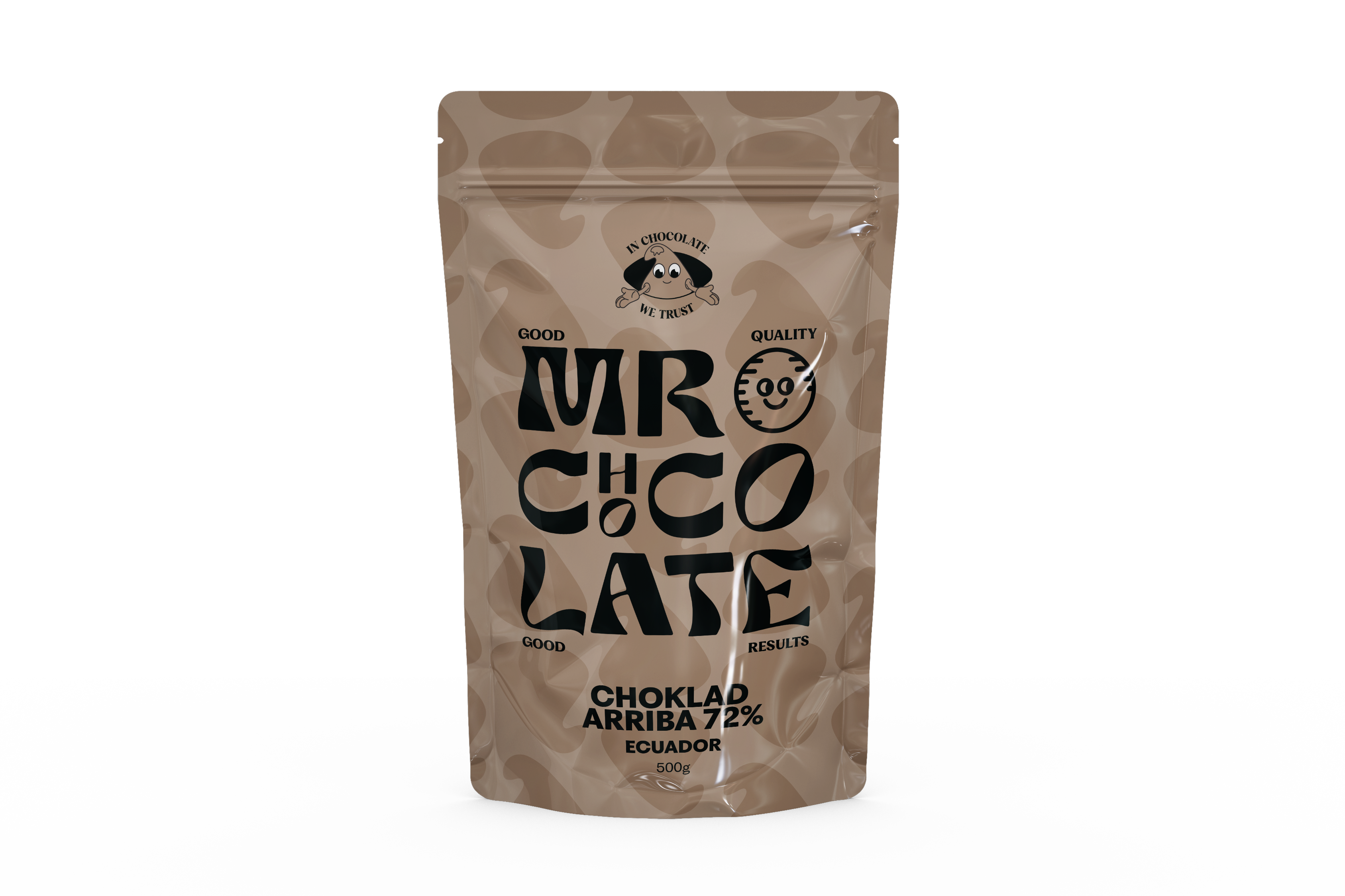
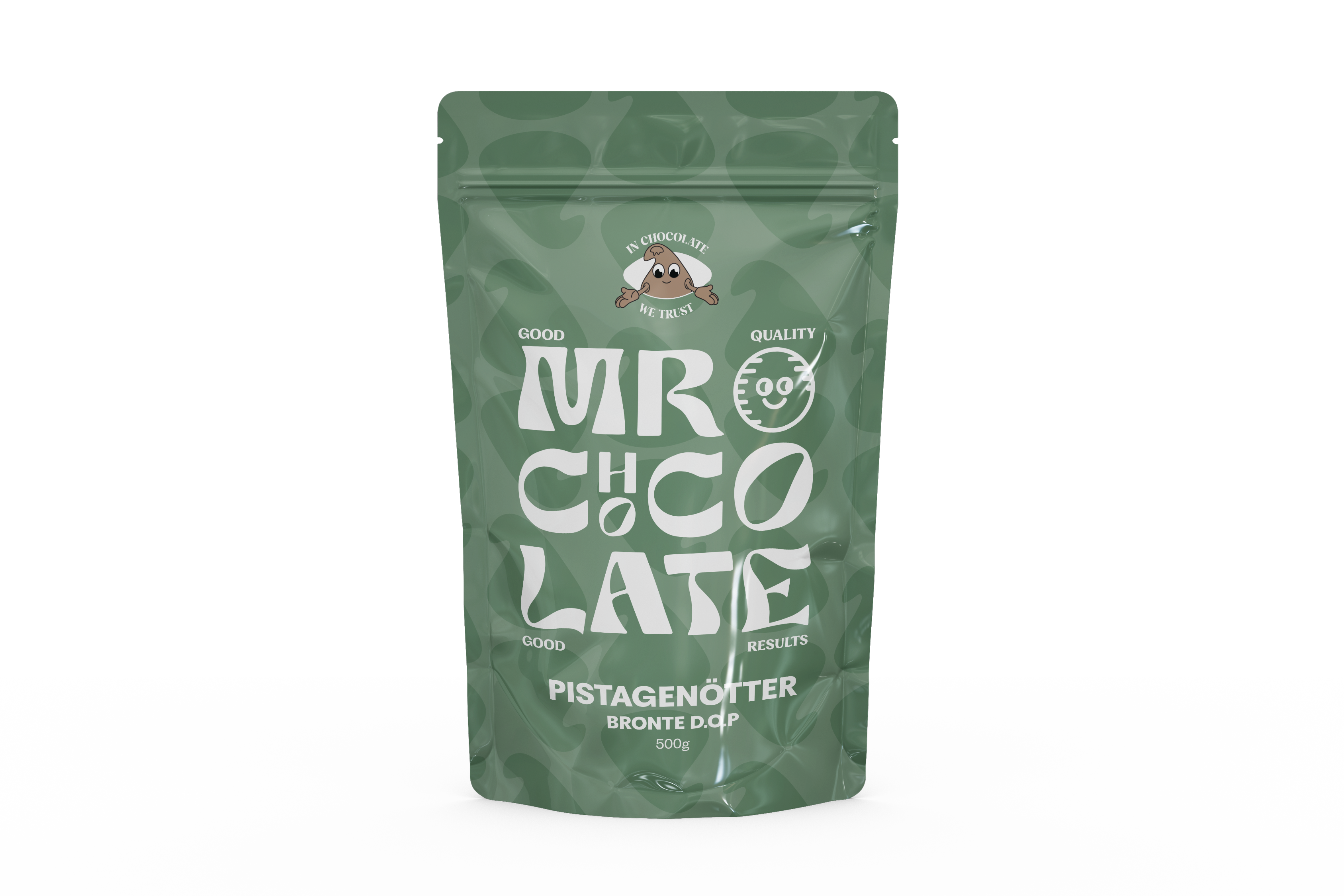
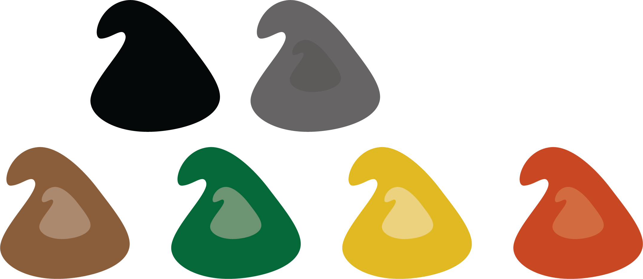
The analysis gave me a starting point to start my design process. This is the final product.
Logo


Packaging
Sorbitol
Chocolate

Pistage

Mascot
Color palett
Typeface


